
Enamel pins have become a popular medium for expression, and as a pin maker, it's important to understand the basics of text and typography when designing your pins. When it comes to creating enamel pins, the use of text and typography can make or break the design. As a pin maker, it's essential to understand the requirements and considerations when incorporating text into your designs.
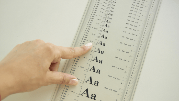
First and foremost, readability is key. The text on your pins should be easy to read and understand, even when the pin is worn on clothing. This means using simple, legible fonts and avoiding overly detailed or ornate designs. It's also important to consider the size of the text, as small text can be difficult to read at a glance. Use a font size that is at least 8pt for legibility.
Legibility is another important aspect to consider when using text in enamel pins. The text should be clear and easy to read, even when the pin is worn on clothing. Bold and thick fonts are recommended to make the text more visible. Additionally, pay attention to the spacing between letters and the overall layout of the text to ensure that it is easy to read.
When designing your pins, it's also important to keep in mind that text is an essential element of the design. The text should be used to complement the overall design, rather than overpower it. A good rule of thumb is to keep the text simple and avoid using too many different fonts or styles. Instead, stick to one or two fonts that complement the overall design.
Another important consideration is color. The text color should contrast well with the pin background color, making it easy to read. Avoid using light-colored text on a light background or dark text on a dark background as it can be difficult to read.
Finally, the placement of text on the enamel pin is crucial. The text should be placed in an area that is easily visible and easy to read. Avoid placing text in areas that are likely to be obscured by clothing or other objects when the pin is worn.
In conclusion, text and typography play a crucial role in enamel pin design. By considering readability, legibility, overall layout, and placement, you can create pins that are not only visually appealing but also easy to read and understand. Remember to keep it simple, bold, and easy to read. Always keep your target audience and the purpose of your pin in mind when designing.
Still need help? Book a free consultation with one of our lead artists here.